Chart of the Day: The Long Decline in Interest Rates

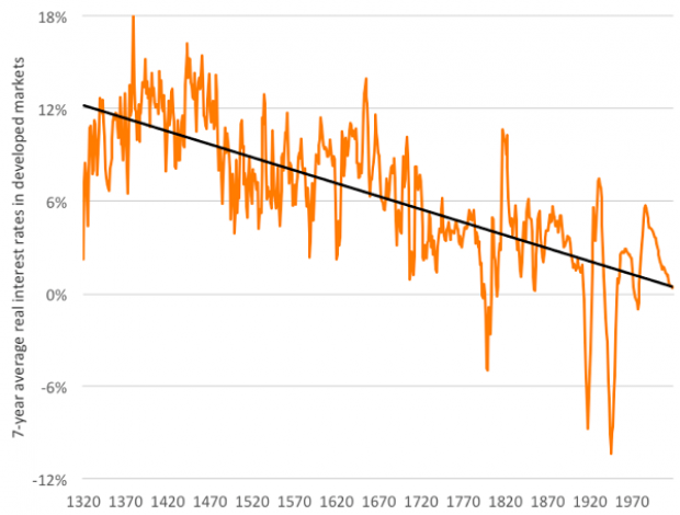
Are interest rates destined to move higher, increasing the cost of private and public debt? While many experts believe that higher rates are all but inevitable, historian Paul Schmelzing argues that today’s low-interest environment is consistent with a long-term trend stretching back 600 years.
The chart “shows a clear historical downtrend, with rates falling about 1% every 60 years to near zero today,” says Bloomberg’s Aaron Brown. “Rates do tend to revert to a mean, but that mean seems to be declining.”
Congressional Report of the Day: The US Pays Nearly 4 Times More for Drugs

The House Ways and Means Committee released a new analysis of drug prices in the U.S. compared to 11 other developed nations, and the results, though predictable, aren’t pretty. Here are the key findings from the report:
- The U.S. pays the most for drugs, though prices varied widely.
- U.S. drug prices were nearly four times higher than average prices compared to similar countries.
- U.S. consumers pay significantly more for drugs than other countries, even when accounting for rebates.
- The U.S. could save $49 billion annually on Medicare Part D alone by using average drug prices for comparator countries.
Read the full congressional report here.
Chart of the Day: How the US Ranks for Retirement

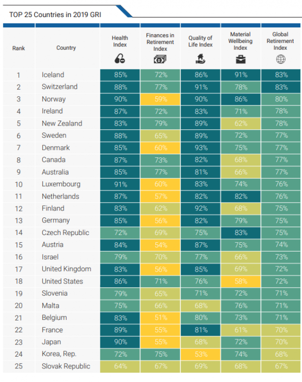
The U.S. ranks 18th for retiree well-being among developed nations, according to the latest Global Retirement Index from Natixis, the French corporate and investment bank. The U.S. fell two spots in the ranking this year, due in part to rising economic inequality and poor performance for life expectancy.
Trump Touts ‘Inspirational’ Middle Class Tax Cut

President Trump said Thursday that he is working on a new tax cut for middle-class households, to be unveiled “sometime in the next year.”
Speaking to lawmakers at the GOP retreat in Baltimore, Trump said, “we’re working on a tax cut for the middle-income people that is going to be very, very inspirational. … it'll be a very, very substantial tax cut for middle-income folks who work so hard.”
The president, who has hinted at tax cuts several times over the last year without producing any specific proposals, provided no further details. Although House Speaker Nancy Pelosi and other Democratic lawmakers have said they are open to the idea of a middle-class tax cut, their insistence that new cuts be paid for with tax increases on the wealthy make it unlikely that the president will be able to make a deal on the issue with a divided Congress.
White House economic adviser Larry Kudlow told reporters Friday that the tax-cut plan would be made public “sometime in the middle of next year,” putting the release date close to the 2020 election.
Republican lawmakers may be more focused on making permanent their 2017 tax cuts, some of which are set to expire after 2025. “The first and most important step is we can make the cuts for families and small business permanent,” Rep. Kevin Brady, the ranking Republican on the tax-writing House Ways and Means Committee, said Friday.
Trump Diverting $3.6 Billion from Military to Build Border Wall

The Department of Defense has approved a plan to divert $3.6 billion to pay for the construction of parts of President Trump’s border wall, Defense Secretary Mark Esper said Tuesday. The money will be shifted from more than 100 construction projects focused on upgrading military bases in the U.S. and overseas, which will be suspended until Congress provides additional funds.
In a letter addressed to Senator James Inhofe, chair of the Armed Services Committee, Esper said that in response to the national emergency declared by Trump earlier this year, he was approving work on 11 military construction projects “to support the use of armed forces” on the border with Mexico.
The $3.6 billion will fund about 175 miles of new and refurbished barriers (Esper’s letter does not use the term “wall”).
Esper described the projects, which include new and replacement barriers in San Diego, El Paso and Laredo, Texas, as “force multipliers” that, once completed, will allow the Pentagon to redeploy troops to high-traffic sections of the border that lack barriers. About 5,000 active duty and National Guard troops are currently deployed on the border.
Months in the making: Trump’s declaration of a national emergency on the southern border on February 15, 2019, came in the wake of a showdown with Congress over funding for the border wall. The president’s demand for $5.7 billion for the wall sparked a 35-day government shutdown, which ended when Trump reluctantly agreed to a deal that provided $1.375 billion for border security. By declaring a national emergency, Trump gave the Pentagon the legal authority to move billions of dollars around in its budget to address the purported crisis. Legal challenges to the emergency declaration are ongoing.
Conflict with lawmakers: Congress passed a resolution opposing the national emergency declaration in March, prompting Trump to issue the first veto of his presidency. Democrats on the House Appropriations Committee reiterated their opposition to Trump’s move Tuesday, saying in a letter, “As we have previously written, the decision to take funds from critical military construction projects is unjustified and will have lasting impacts on our military.”
Majority Leader Steny H. Hoyer was more forceful, saying in a statement, "It is abhorrent that the Trump Administration is choosing to defund 127 critical military construction projects all over the country … and on U.S. bases overseas to pay for an ineffective and expensive wall the Congress has refused to fund. This is a subversion of the will of the American people and their representatives. It is an attack on our military and its effectiveness to keep Americans safe. Moreover, it is a political ploy aimed at satisfying President Trump's base, to whom he falsely promised that Mexico would pay for the construction of an unnecessary wall, which taxpayers and our military are now being forced to fund at a cost of $3.6 billion.”
A group of 10 Democratic Senators said in a letter to Esper that they “are opposed to this decision and the damage it will cause to our military and the relationship between Congress and the Department of Defense.” They said they also “expect a full justification of how the decision to cancel was made for each project selected and why a border wall is more important to our national security and the well-being of our service members and their families than these projects.”
Politico’s John Bresnahan, Connor O'Brien and Marianne LeVine said the diversion will likely be unpopular with Republican lawmakers as well. Republican Senators Mike Lee and Mitt Romney expressed concerns Wednesday about funds being diverted from their home state of Utah. "Funding the border wall is an important priority, and the Executive Branch should use the appropriate channels in Congress, rather than divert already appropriated funding away from military construction projects and therefore undermining military readiness," Romney said.
The Pentagon released a list of construction projects that will be affected late on Wednesday (you can review a screenshot tweeted by NBC News’ Alex Moe here).
An $8 billion effort: In addition to the military construction funds and the money provided by Congress, the Trump administration is using $2.5 billion in drug interdiction money and $600 million in Treasury forfeiture funds to support the construction of barriers on the southern border, for a total of approximately $8 billion. (More on that here.)
The administration reportedly has characterized the suspended military construction projects as being delayed, but to be revived, those projects would require Congress approving new funding. House Democrats have vowed they won’t “backfill” the money.
The politics of the wall: Trump has reportedly been intensely focused on making progress on the border wall, amid news that virtually no new wall has been built during the first two and a half years of his presidency. Speaking to reporters at the White House Wednesday, Trump said that construction on the wall is moving ahead “rapidly” and that hundreds of miles will be “almost complete if not complete by the end of next year … just after the election.”
About 90% of Trump Counties Have Received Trade War Farm Aid

President Trump won more than 2,600 of the nation’s 3,000-plus counties in the 2016 election, and residents in nearly 90% of those counties – or more than 2,300 – have received some level of aid from the administration’s Market Facilitation Program, a $16 billion effort that compensates farmers for losses incurred as a result of Trump’s trade war with China.
Drawing on a new report from the Environmental Working Group, The Washington Post’s Philip Bump says the data “show the extent to which [the farm] subsidies overlap with Trump’s base of political support.”
To be fair, about 80% of the counties Hillary Clinton won also received some degree of aid, Bump says, but there are many fewer of them, given the concentration of her supporters in urban areas.
Overall, residents in more than 2,600 counties in the U.S. have received payments from the farm aid program, with the heaviest concentration in the Midwest.


