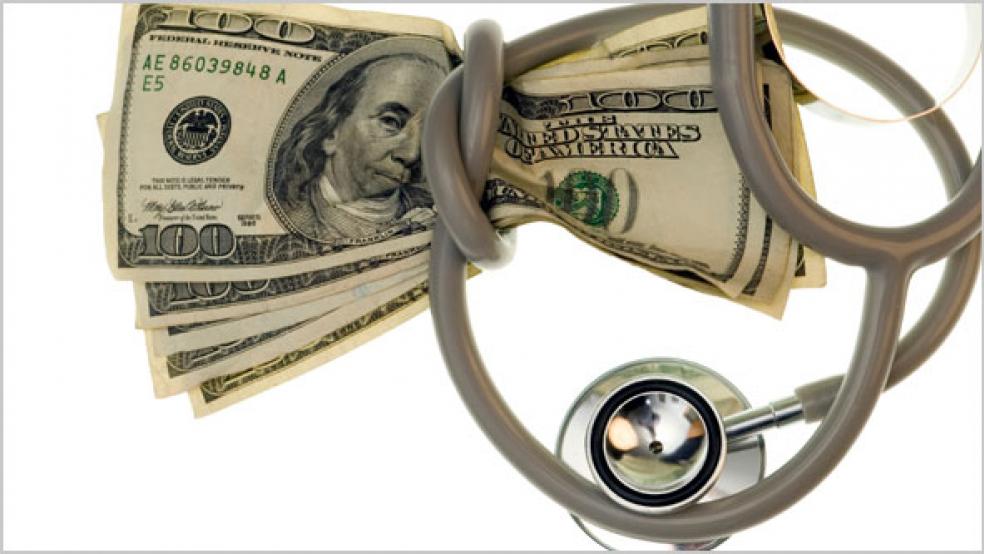
An analysis of more than 1.8 billion medical claims by the Health Care Cost Institute found that prices for health care services rose about 13 percent between 2012 and 2016, while usage dropped by about 17 percent.
The institute examined medical services in 43 states and 112 localities and found that while there is an overall pattern, there is also wide variation in costs and frequency of usage in different parts of the country. Some areas had similar prices but dissimilar usage, while others had roughly the same level of usage but at very different prices.
Bill Johnson, a researcher with HCCI, said, "To us, the most interesting finding was just the extent of variation—not only in how much the same services cost or were used in areas across the country, but also in how price and use compared within metros. There were plenty of examples where you could find two metro areas where prices were essentially the same. For example Oxnard, California, and New Haven, Connecticut—New Haven used almost 50% more services."
"What this variation suggests is that there is really a different story explaining healthcare costs almost everywhere you look," Johnson added.
HCCI presents its findings in an interactive map that lets you call up pricing and usage data on an interactive map. Review medical prices and usage in your area at HCCI’s Healthy Marketplace Index.


