Google’s New Logo Is a Sign of Where the Company Is Headed

Google is shaking things up again, rolling out a new logo that indicates where the company is going even as it keeps the colored letters that have become so familiar. The company’s most significant redesign since 1999 does away with the old font and its serifs (those little lines at the end of each character) and replaces them with the same custom typeface used in the logo for Google’s new parent company, Alphabet.
The new look does more than just make the logo sleeker and more modern while echoing the newly created holding company. It also speaks to where Google is going — namely, its increasing presence on our mobile devices. Google’s Vice President of Product Management Tamar Yehoshua and Director of User Experience Bobby Nath explained the transition on the company’s blog:
“Once upon a time, Google was one destination that you reached from one device: a desktop PC. These days, people interact with Google products across many different platforms, apps and devices—sometimes all in a single day. You expect Google to help you whenever and wherever you need it, whether it’s on your mobile phone, TV, watch, the dashboard in your car, and yes, even a desktop!”
Related: 10 Biggest Tech Flops of the Century
Google said in May that the number of searches on mobile devices had surpassed those on computers in 10 countries, including the U.S. and Japan. Its simplified new logo will load faster and read better “even on the tiniest screens.” And when six letters are still too much to fit on one of those tiny screens, the company will present a four-color “G” icon that matches its new logo, or four animated dots that morph into other forms; the swirling new feature is meant to “represent Google’s intelligence at work and indicate when Google is working for you,” according to a post on Google’s Design blog.
In other words, they’re a tiny bit of swirling fun that will placate you as you wait for your information to load — and remind you that you’re using a Google service and not some other company’s product. Together, the new logo, the new “G” icon and the colored dots are Google’s way to keep stamping its brand on our increasingly mobile world.
Top Reads from The Fiscal Times
- Why McDonald’s could Suddenly Be Responsible for Millions of New Employees
- The 10 Worst States for Property Taxes
- U.S. Companies Are Dying Faster than Ever
Chart of the Day: SALT in the GOP’s Wounds

The stark and growing divide between urban/suburban and rural districts was one big story in this year’s election results, with Democrats gaining seats in the House as a result of their success in suburban areas. The GOP tax law may have helped drive that trend, Yahoo Finance’s Brian Cheung notes.
The new tax law capped the amount of state and local tax deductions Americans can claim in their federal filings at $10,000. Congressional seats for nine of the top 25 districts where residents claim those SALT deductions were held by Republicans heading into Election Day. Six of the nine flipped to the Democrats in last week’s midterms.
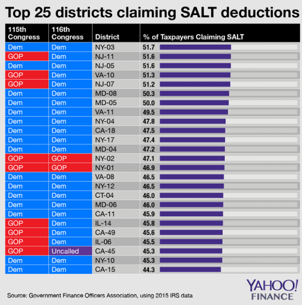
Chart of the Day: Big Pharma's Big Profits
Ten companies, including nine pharmaceutical giants, accounted for half of the health care industry's $50 billion in worldwide profits in the third quarter of 2018, according to an analysis by Axios’s Bob Herman. Drug companies generated 23 percent of the industry’s $636 billion in revenue — and 63 percent of the total profits. “Americans spend a lot more money on hospital and physician care than prescription drugs, but pharmaceutical companies pocket a lot more than other parts of the industry,” Herman writes.
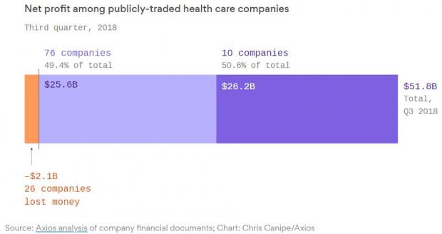
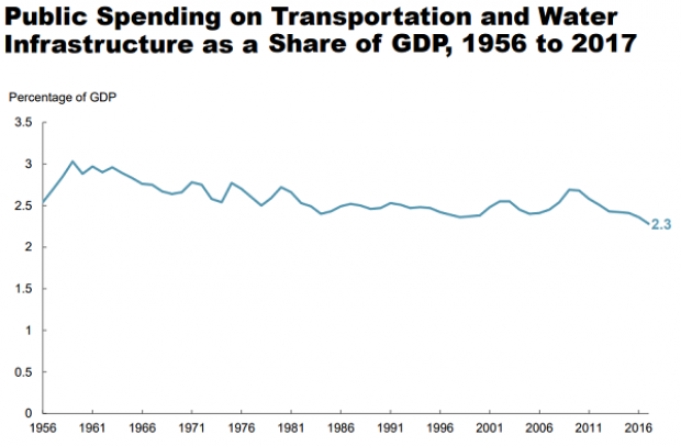
Chart of the Day: Infrastructure Spending Over 60 Years

Federal, state and local governments spent about $441 billion on infrastructure in 2017, with the money going toward highways, mass transit and rail, aviation, water transportation, water resources and water utilities. Measured as a percentage of GDP, total spending is a bit lower than it was 50 years ago. For more details, see this new report from the Congressional Budget Office.
Number of the Day: $3.3 Billion
The GOP tax cuts have provided a significant earnings boost for the big U.S. banks so far this year. Changes in the tax code “saved the nation’s six biggest banks $3.3 billion in the third quarter alone,” according to a Bloomberg report Thursday. The data is drawn from earnings reports from Bank of America, Citigroup, Goldman Sachs, JPMorgan Chase, Morgan Stanley and Wells Fargo.
Clarifying the Drop in Obamacare Premiums
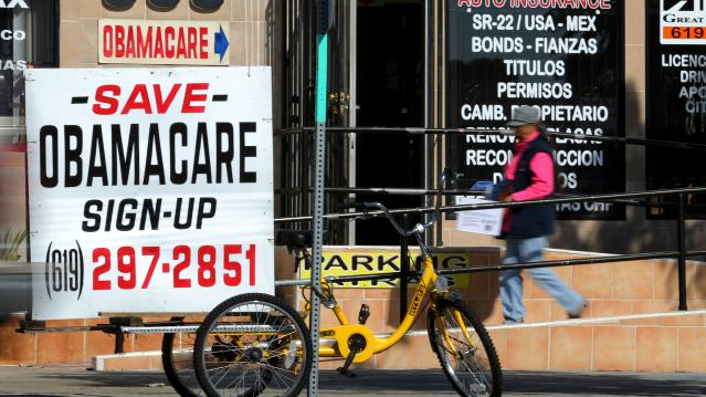
We told you Thursday about the Trump administration’s announcement that average premiums for benchmark Obamacare plans will fall 1.5 percent next year, but analyst Charles Gaba says the story is a bit more complicated. According to Gaba’s calculations, average premiums for all individual health plans will rise next year by 3.1 percent.
The difference between the two figures is produced by two very different datasets. The Trump administration included only the second-lowest-cost Silver plans in 39 states in its analysis, while Gaba examined all individual plans sold in all 50 states.