Google’s New Logo Is a Sign of Where the Company Is Headed

Google is shaking things up again, rolling out a new logo that indicates where the company is going even as it keeps the colored letters that have become so familiar. The company’s most significant redesign since 1999 does away with the old font and its serifs (those little lines at the end of each character) and replaces them with the same custom typeface used in the logo for Google’s new parent company, Alphabet.
The new look does more than just make the logo sleeker and more modern while echoing the newly created holding company. It also speaks to where Google is going — namely, its increasing presence on our mobile devices. Google’s Vice President of Product Management Tamar Yehoshua and Director of User Experience Bobby Nath explained the transition on the company’s blog:
“Once upon a time, Google was one destination that you reached from one device: a desktop PC. These days, people interact with Google products across many different platforms, apps and devices—sometimes all in a single day. You expect Google to help you whenever and wherever you need it, whether it’s on your mobile phone, TV, watch, the dashboard in your car, and yes, even a desktop!”
Related: 10 Biggest Tech Flops of the Century
Google said in May that the number of searches on mobile devices had surpassed those on computers in 10 countries, including the U.S. and Japan. Its simplified new logo will load faster and read better “even on the tiniest screens.” And when six letters are still too much to fit on one of those tiny screens, the company will present a four-color “G” icon that matches its new logo, or four animated dots that morph into other forms; the swirling new feature is meant to “represent Google’s intelligence at work and indicate when Google is working for you,” according to a post on Google’s Design blog.
In other words, they’re a tiny bit of swirling fun that will placate you as you wait for your information to load — and remind you that you’re using a Google service and not some other company’s product. Together, the new logo, the new “G” icon and the colored dots are Google’s way to keep stamping its brand on our increasingly mobile world.
Top Reads from The Fiscal Times
- Why McDonald’s could Suddenly Be Responsible for Millions of New Employees
- The 10 Worst States for Property Taxes
- U.S. Companies Are Dying Faster than Ever
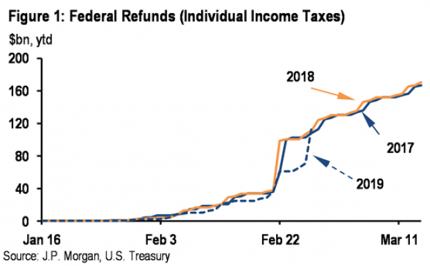
Tax Refunds Rebound
Smaller refunds in the first few weeks of the current tax season were shaping up to be a political problem for Republicans, but new data from the IRS shows that the value of refund checks has snapped back and is now running 1.3 percent higher than last year. The average refund through February 23 last year was $3,103, while the average refund through February 22 of 2019 was $3,143 – a difference of $40. The chart below from J.P. Morgan shows how refunds performed over the last 3 years.
Number of the Day: $22 Trillion
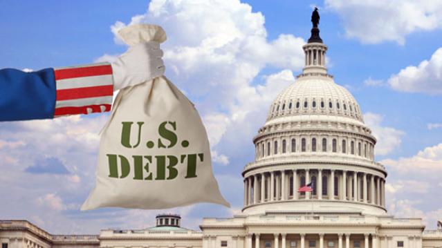
The total national debt surpassed $22 trillion on Monday. Total public debt outstanding reached $22,012,840,891,685.32, to be exact. That figure is up by more than $1.3 trillion over the past 12 months and by more than $2 trillion since President Trump took office.
Chart of the Week: The Soaring Cost of Insulin
The cost of insulin used to treat Type 1 diabetes nearly doubled between 2012 and 2016, according to an analysis released this week by the Health Care Cost Institute. Researchers found that the average point-of-sale price increased “from $7.80 a day in 2012 to $15 a day in 2016 for someone using an average amount of insulin (60 units per day).” Annual spending per person on insulin rose from $2,864 to $5,705 over the five-year period. And by 2016, insulin costs accounted for nearly a third of all heath care spending for those with Type 1 diabetes (see the chart below), which rose from $12,467 in 2012 to $18,494.
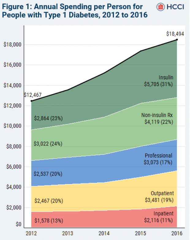
Chart of the Day: Shutdown Hits Like a Hurricane

The partial government shutdown has hit the economy like a hurricane – and not just metaphorically. Analysts at the Committee for a Responsible Federal Budget said Tuesday that the shutdown has now cost the economy about $26 billion, close to the average cost of $27 billion per hurricane calculated by the Congressional Budget Office for storms striking the U.S. between 2000 and 2015. From an economic point of view, it’s basically “a self-imposed natural disaster,” CRFB said.

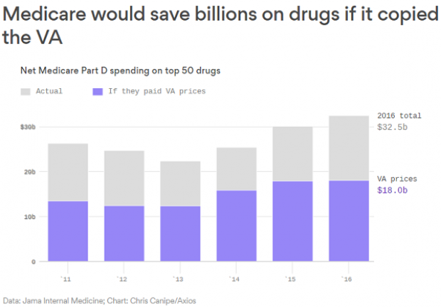
Chart of the Week: Lowering Medicare Drug Prices

The U.S. could save billions of dollars a year if Medicare were empowered to negotiate drug prices directly with pharmaceutical companies, according to a paper published by JAMA Internal Medicine earlier this week. Researchers compared the prices of the top 50 oral drugs in Medicare Part D to the prices for the same drugs at the Department of Veterans Affairs, which negotiates its own prices and uses a national formulary. They found that Medicare’s total spending was much higher than it would have been with VA pricing.
In 2016, for example, Medicare Part D spent $32.5 billion on the top 50 drugs but would have spent $18 billion if VA prices were in effect – or roughly 45 percent less. And the savings would likely be larger still, Axios’s Bob Herman said, since the study did not consider high-cost injectable drugs such as insulin.